
JODIE BARR | PRODUCT DESIGNER
Redesigning a field service app without a net
iVueit connects businesses with gig workers for on-site verification tasks. I joined as the sole designer to rebuild the core experience from scratch with no requirements, no design team, and no process.
Role
Sole Designer
Platform
iOS
Type
Full Redesign • Contract

Map View

Survey View
The Challenge
On paper, the brief was a full redesign. In actuality, the real challenge was organizational. There was no dedicated design team, no written requirements, and no established design process. Since there was no product design background within this environment, t I was often received direction from multiple stakeholders with conflicting priorities.
"There were too many decision makers and no decision-making process. My job became as much about creating alignment as creating design."
No design team
First and only Product Designer in org
No requirements
Nothing written down before design began
Many stakeholders
Conflicting priorities, no single owner
I had to simultaneously:
• Draw the line between experiences that were being isolated
• Define and advocate for user intentions
• Build trust with stakeholders who had never worked with a Product Designer
• Ship working in fast paced environment with moving targets and priorities
My Approach
Without written requirements or support to build a design system, I had to find another way to build alignment and elevate the work. I leveraged competitor analysis. I researched how comparable apps and features that or users were already familiar with, solved the same problem. This gave stakeholder something concrete to react to. It helped to shift the focus from "I don't like this" to "this is what aligns with user mental models".
To manage the expectation of producing screens weekly while still advocating for better decisions, I developed a 3 option presentation style to reduce swirl and time lost trying to reach alignment on key screens.
Their Proposal
what stakeholders wanted
My Recommendation
my proposal, backed by competitor analysis, UX rationale, and best
Middle Ground
a version that met business needs while preserving the most important design decisions
This gave stakeholders tangible solutions to react which received better feedback vs. verbal reasoning. It also helped shift the focus toward user flows rather than isolated screens which was how stakeholders initially approached the redesign. Once other options were presented the question of "What comes before and after?" became more clear.
Finding ways to blend and tailor the process to fit inside the constraints given.
Navigating the Constraints
Bridging the Gap on UX Standards
Every screen required groundwork, establishing baseline UX principles became an active part of the process. Designing for user mental models, applying color theory, standardizing iconography were seen as creative preferences, this thinking is high stakes. I made it a priority with every design decision, explaining the rationale in terms of user behavior rather than design opinion.
Making the Invisible Visible
One of the most important things I could do as a designer can do in this process light environment was surface the downstream cost of short-term decisions. I didn't want constraints to limit the product's ability to evolve. Whether it was a rigid layout, a one-off pattern, incorrect architecture or incorrect pattern usage, I flagged it explicitly. Not to be difficult, but as a trade-off. Showing the future cost of the decision to get buy-in.
Advocating for Evolution, no Just Execution
The default organizational mindset was "this is how we do it and it works." I consistently reframed that as a starting point, not a ceiling. The challenge was making friction and poor UX visible to people who had never seen their app through a user's eyes — and doing it without user research to point to. Competitor analysis and UX precedent became my proxy for user data.
Understanding the User and Missed Opportunity
The app's primary user leaned older, something I attributed directly to the product's lack of modern usability conventions. That wasn't just a design observation, it was a business opportunity. A more accessible, intuitive experience would prove positive for existing users and expand the market. I brought this framing into design conversations to connect UX decisions to business outcomes.
Key Screens
BEFORE
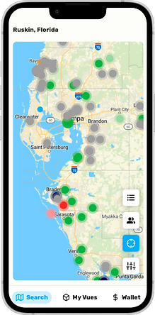
Map View

Map View

My Vues

Wallet
AFTER

Map View

Vue Details

Survey View

Wallet View
Outcomes
3
Products shipped
65%
Key decisions won through influence
Products Delivered
1 Re-designed App
| 1 Scheduling App (internal)
| 1 Appointment/User Management Tool (Internal)
| +Client Portal Enhancements